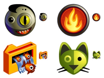
Icon design is deceptively simple. Professional web icons translate well because they’ve specifically been designed to do so while still complementing the user interface. An effective icon is, among other things, clear, sized appropriately, and consistent with other icons.

Turbomilk, a Russian visual interface design company, has posted “10 Mistakes in Icon Design” on its eponymous blog. Number one is, of course, not enough differentiation between icons, even stock icons. Due to the small size, it’s easy to confuse similar icons for one another, which can frustrate the user’s experience. Other interesting observations include overcrowding icons with too many images, adding unnecessary perspective and shadows, and not accounting for national/cultural differences in objects (such as a mailbox).
